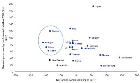
This chart is enough to keep you awake at night.
The Y-axis shows government financial liabilities. New Zealand is not badly placed, thanks to many years of fiscal surpluses which ran down government debt (before the return to large budget deficits which began under the last Labour government).
The X-axis shows net foreign assets (as a % of GDP). At around -90%, we are in the same category as the PIGS (although more of our liabilities are in the form of equity, which is a positive factor, with foreign investors – including dreaded multinational companies – bearing some of the risk).
Behind this exposure are the large current account deficits of the Michael Cullen era. He wrongly diagnosed them as a savings problem, rather than a problem of declining international competitiveness.
The CAD has subsequently narrowed but rebalancing of the economy has a long way to go, and the government is forecasting large deficits to re-emerge when the economy picks up.
All this matters because things could turn ugly for New Zealand in global financial markets, with access to credit being limited again (as it was during the GFC) and our credit rating cut. Prime minister John Key is right to be clamping down on government spending to try to avert this outcome.


You say that it is positive that more of our foreign liabilities are in the form of equity. I’m not sure that this is positive at all, but not for the reasons the political left-wing would espouse. It would be interesting to see the changes in debt and equity positions over time. If we have seen a significant decline in our net equity position excluding debt, then that in itself is a serious indictment on the New Zealand business environment.
Easy to fix. Increase taxes on those who benefit most from our society.
FTT, CGT and wealth taxes.
Pingback: A note on NZ’s debt level » TVHE