FRIDAY GRAPH: BURGEONING PUBLIC SECTOR, WANING EXPOSED SECTOR

Click to enlarge

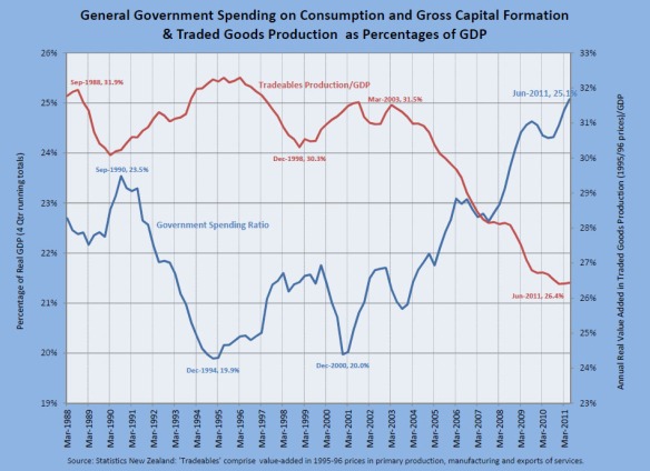
This Friday’s graph uses Statistics New Zealand’s just-released real GDP figures for the June Quarter to compare the rise in general government spending on goods and services (current consumption and gross fixed capital formation) as a proportion of GDP with the decline in the contribution of the production of traded goods in GDP.

According to one prominent line of economic reasoning, if government spending is predominantly focused on non-traded goods, a rise in such spending can be expected to reduce the competitiveness of the exposed sectors of the economy (ie firms that are exposed to international competition), thereby worsening export performance.  The chart is suggestive in this context.

ASSORTED LINKS

Milton Friedman worried about the Euro long ago

Canterbury University economist Eric Crampton crunches the numbers on the minimum wage

Video analysis and scene replication suggests that Al Gore’s Climate Reality Project fabricated their Climate 101 video “Simple Experiment”

George Mason University economist Walter Williams adds weight to the pervasive ‘social security = Ponzi scheme’ theory

Café Hayek’s Don Boudreaux rewrites a Wall Street Journal report on cheap
Chinese imports
low-cost technology

Member of the European Parliament Daniel Hannan blogs about the likely Greece bailout
And here he is talking about it in the European Parliament:

Daily Telegraph and Spectator writer James Delingpole talks about ‘ManBearPig’,
‘Watermelons’ and Climategate
 (link and below)

HOW RELIABLE IS NET MIGRATION AS AN INDICATOR OF RELATIVE LIVING STANDARDS IN NEW ZEALAND AND AUSTRALIA?

A guest blog by Australian economist Winton Bates

In a comment on Treasury’s Living Standards Framework (posted on July 13) Roger quoted my suggestion that it would be hard to find a better indicator of relative living
standards as perceived by New Zealanders and Australians than net emigration to Australia. I had argued on my blog that net emigration to Australia would be a reliable indicator because the preferences that people show about where they live must be heavily based on their assessments of living standards.

However, the reliability of net migration as a living standards indicator is not beyond
dispute. Claims have been made (in this paper, for example) that migration motivated by the prospect of increased income might not bring greater happiness. There does
not seem to be much evidence in support of such claims, but even if migration tends
to make people less happy that would not necessarily mean that decisions to migrate are mistaken. It is possible for migrants to decide that it is worthwhile to make the sacrifices associated with moving to unfamiliar surroundings in order to provide greater opportunities for their children.

Is there evidence that migration from New Zealand to Australia is actually motivated
predominantly by the prospect of achieving higher material living standards? The existence of a substantial income differential in Australia’s favour makes this the most obvious motivation, although other factors are also relevant. For example, Statistics NZ has estimated that since the devastating earthquake at Christchurch on 22 February, there have been 4,900 ‘permanent and long term’ (PLT) international departures from that city compared with 3,000 during the same period in 2010.

The chart below suggests that the variation from year to year in net PLT departures from New Zealand to Australia is related to the push factor of unfavourable perceptions of the New Zealand economy. The consumer confidence indexes used in the chart (from Roy Morgan Research) indicate respondents’ perceptions of current and future financial conditions of their families and nations. There has obviously been fairly close correspondence between the consumer confidence indexes for Australia and New Zealand over the past decade. The chart suggests that more New Zealanders have tended to migrate to Australia when economic prospects have generally been perceived to be dismal in New Zealand, even though this has coincided with periods when Australians have been similarly dismal about their own economic prospects.

Is there any evidence that New Zealanders achieve higher living standards when they
migrate to Australia? Perhaps the strongest evidence is that New Zealanders keep migrating to Australia and that the numbers departing usually far exceed the numbers returning. If the experience was generally an unhappy one, it would seem reasonable to expect that the message would get around among potential migrants and migration would decline.

Available evidence suggests that the migrants to Australia are generally fairly happy. One study found that the proportion of migrants from an English-speaking background who were happy or very happy was about the same as for Australian-born respondents. I know of only one survey which has focused on migration from New Zealand to Australia, that by Alison Green, Mary Power and Deannah Jang in 2005.  These authors surveyed New Zealand migrants, mainly living in southern Queensland, and a group of New Zealand residents (stayers) who had links to Australia (e.g. through visiting family or living there). As might be expected, the survey results suggest that the migrants were
less satisfied with life in New Zealand than the stayers. The level of satisfaction of migrants with life in Australia was much the same whether or not they were dissatisfied with life in New Zealand. The authors concluded that the migrants were generally highly satisfied with their decision to relocate.

I have yet to find a reason why net migration should not be viewed as a reliable indicator of relative living standards in Australia and New Zealand.

Ticket Scalping is a Secondary Market Activity

Noting Wednesday’s Dominion Post cover story on the ballooning black market in RWC tickets, I recalled a Business Roundtable submission we made on the Major Events Management Bill in 2008. We said

  • No case is made that the common law is inefficient or problematic in respect of scalping.
  • Ticket scalping is a secondary market activity. It provides a valuable social function like other secondary markets in that tickets can end up in the hands of those who value them most highly.
  • It also caters for the needs of those who cannot spare the time to queue, those who do not know whether they will be too busy to attend an event until close to the time at which it is being held, those who change their minds after an event is sold out, and those who find they cannot make use of their tickets and can offer them for resale.
  • There are many ways that promoters can limit scalping activity if they wish to do so, such as making tickets non-transferable, limiting the numbers that any one individual may buy, or auctioning a block of tickets themselves.
  • Such a law would be difficult and costly to enforce, given selling mechanisms such as the internet and the black market.
  • There seems no logic in applying such laws solely to ‘major events’. If they were justified they should apply generally.

Business New Zealand made a similar statement at the time. This was an MED initiative that continued its fine tradition of mindless intervention.  It was hard at the time to see a case for the government to intervene between willing sellers and willing buyers, or that it would have been effective had it chosen to do so. The same arguments appear to hold true today.

FRIDAY GRAPH: WE WOULDN’T ACCEPT SUCH MEDIOCRE OUTCOMES FROM THE ALL BLACKS

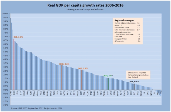
Brace yourselves: this is a seriously scary chart.  According to the latest IMF World Economic Forum forecasts released this week, 148 countries will grow real GDP per capita faster than New Zealand in the decade to 2016. Gallingly, they include Australia – of course.

We wouldn’t accept such mediocre outcomes from the All Blacks, yet it says much about our priorities that we accept it for economic performance.

Our governments don’t hesitate to set grandiose targets for raising living standards.  The last Labour government said repeatedly that its top economic goal was to lift New Zealanders’ average standard of living back into the top half of the OECD by 2010.  The current National government has the stated goal of catching Australia by 2025.

Labour never had a credible strategy for achieving its goal, and National has yet to unveil one.  And even if it had a strategy, would it have the will and ability to achieve it under MMP?

The current government set up a 2025 Taskforce which produced two high-quality reports. These were regarded as politically unpalatable and accordingly side-lined.  Their orthodox OECD style recommendations would have given New Zealanders a much better chance for a more successful and prosperous future.

This is not a simple matter of blaming the politicians.  If the electorate rewards political parties for grandiose goals with nothing to back them up, the chart indicates what we can expect to get.

WE CAN STILL CHOOSE REFORM OVER DECAY

The Wall Street Journals Brett Stephens this week predicted “a long, likely parade of horribles” for Europe as a result of the current crises. He suggests that “the riots of Athens will become those of Milan, Madrid and Marseilles. Parties of the fringe will gain greater sway. Border checkpoints will return. Currencies will be resurrected, then devalued. Countries will choose decay over reform.”

In describing the path that Europe took to get to this sorry state of affairs, Stephens catalogs the changes to some key indicators over time.

In 1965, government spending as a percentage of GDP averaged 28% in Western Europe. Today it hovers just under 50%. In 1965, the fertility rate in Germany was a healthy 2.5 children per mother. Today it is a catastrophic 1.35. During the postwar years, annual GDP growth in Europe averaged 5.5%. After 1973, it rarely exceeded 2.3%.

Obviously if Stephens’s dire prognosis proves accurate, New Zealand will be adversely affected by Europe’s decline due to our strong trading relationships. But what about the prospect of a “parade of horribles” for New Zealand itself?

New Zealand government spending has steadily risen since the post-war period and is now around 45 percent of GDP. According to Statistics New Zealand the completed fertility rate for women born in the 1930s averaged 3.54. For women born in 1976 it is now 2.01, below the replacement rate. Annual GDP growth in New Zealand has also slowed over time. We recorded real economic growth of 3.7 percent a year on average between 1992 and 2002.  Since mid-2008, average annual GDP growth has remained below 2 percent.  Productivity growth has slowed. The goal of closing the gap with Australia by 2025 appears now to be more of an embarrassment than a target.

On the positive side, our public debt ratios are relatively healthy and our banks are not heavily invested in bonds issued by heavily indebted European countries.

We do have the ability to improve our performance greatly, but there’s been a lack of leadership to do so for close to a generation. As a result we are unduly drifting and
exposed. The coming general election will give the electorate another chance to send parliament a message.

FRIDAY GRAPH: CONTRIBUTIONS VS BENEFITS

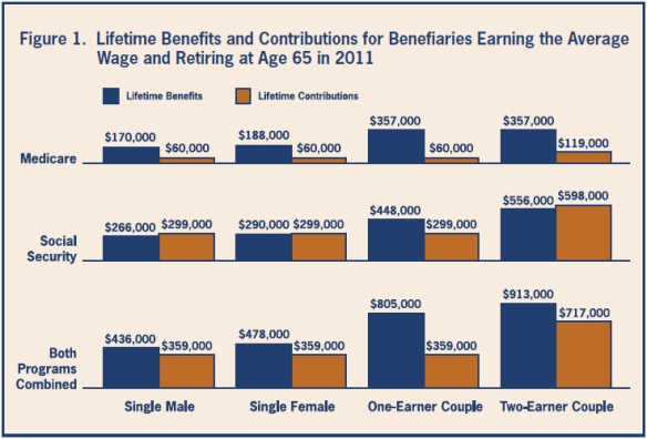
Today’s graph comes via Cam Slater, originally from the National Institute for Health Care Management Foundation.

New Zealand’s arrangements have never been based on an explicit contribution scheme along US lines.  Nevertheless it would be interesting to see the results of a similar exercise using New Zealand’s figures.  I’m laid up at the moment: any takers?

FRIDAY GRAPH: DAVID FARRAR ON MINIMUM WAGE


Today’s Friday graph is a guest blog by Kiwiblog‘s David Farrar, live from the Business Roundtable’s Dunes Symposium.

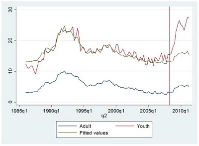
This graph from economist Eric Crampton (http://offsettingbehaviour.blogspot.com/) tells a very sad story. The blue line shows the adult unemployment rate and the red line the youth unemployment rate. As you can see up until 2008, the two rates were significantly linked.

The green line is the best fit line predicting the youth unemployment rate based on the adult unemployment rate. It shows based on the last 20 years of data, that youth unemployment should be around 18% not 28%.

In 2008 Parliament abolished the lower youth rate for the minimum wage. This meant it was illegal to hire a 16 or 17 year old for less than $12 an hour. You do not need to be a rocket scientist or an economist to conclude that the massive increase in youth unemployment is at least partially due to this law change. The best thing the Government could do to lower the youth unemployment rate from 28% is to have the minimum wage only apply to those aged 18 or older.

FRIDAY GRAPH: INDIVIDUAL AUTONOMY AND WELL-BEING

Respected Australian researcher Winton Bates has posted an interesting graphical investigation into the relationship between international measures of freedom and well-being.

His paper concludes that the evidence supports the view that the overall relationship between freedom and well-being is positive.  He further finds that increased feelings of individual agency do not seem to be associated with more selfish behaviour.  “If anything, the opposite seems to be the case.”

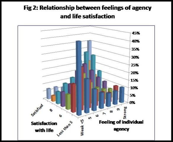
The chart below from his paper illustrates one of the associated relationships – the percentage who have low levels of life satisfaction is much higher among those who feel that they have little ‘freedom and control’ and the percentage with high levels of satisfaction is much higher among those who feel that they have a great deal of ‘freedom and control’.

The chart is based on data for about 80,000 respondents in 57 countries from the 2005 World Values Survey.