FRIDAY GRAPH: OUR FISCAL DEFICIT MAKES ITALY LOOK LIKE A MODEL OF FISCAL PRUDENCE

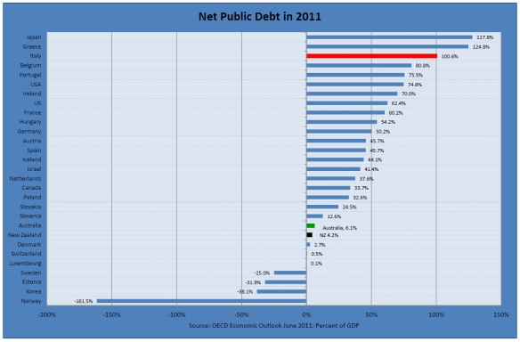
Last week’s chart showed what a strong net public debt position New Zealand is in, compared to Italy and most other OECD countries.  

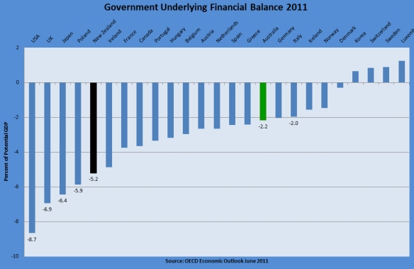
This week’s chart shows that New Zealand is running one of the largest underlying fiscal deficits in the OECD, as a percentage of GDP.

Specifically, New Zealand’s cyclically-adjusted financial balance for 2011 is projected to be minus 5.2 percent of GDP, which is the 5th highest deficit in the OECD, far higher than Australia’s and makes Italy today look like a model of fiscal prudence compared to New Zealand!   For 2012 New Zealand’s projected underlying financial deficit of 5.4 percent of GDP would be the 3rd highest in the OECD.

Much the same rankings for New Zealand for 2011 and 2012 apply for the OECD’s other financial balance indicators – the cyclically-adjusted balance (fourth in both years) and the primary balance (second highest deficit in 2011, no doubt in part because of the Christchurch earthquake, and third highest in 2012).

New Zealand’s underlying fiscal deficit problem arises from the spending excesses post-2005, and the unwillingness of the current government to address the problem more decisively. The latter issue is of particular concern with the government lacking the political will to implement even such obviously necessary measures as eliminating interest-free student loans and raising the age of eligibility for New Zealand Superannuation.

FRIDAY GRAPH: CIAO DOLLAR?

A spate of Sovereign credit downgrades is occurring, with Italy featuring prominently this week following New Zealand’s downgrades the week before.

This week’s chart shows how fundamentally different the situation is in one vital respect between New Zealand and Italy.

In contrast to Italy, and the OECD as a whole, New Zealand does not have a public debt problem (yet, but watch this space given our underlying fiscal deficit).

Whereas 11 countries in the chart have net public debt at or above 50 percent of GDP, New Zealand’s ratio is only 4 percent of GDP according to OECD projections for 2011.

New Zealand has been downgraded for external debt reasons, but since the vast bulk of this debt is between private borrowers and lenders–who have every reason in 2011 to balance risk and return carefully and judiciously–this is a very different situation from that facing Italy and the ten other countries in the chart where government debt is clearly the problem.

FRIDAY GRAPH: THE YOUTH UNEMPLOYMENT SCANDAL

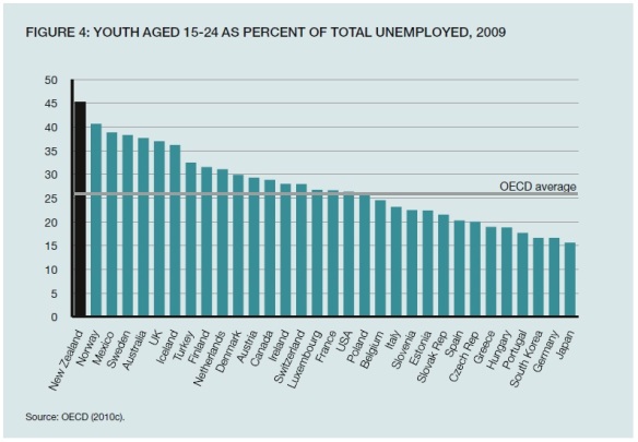
This chart from a recent New Zealand Institute publication tells a familiar story.

We think of countries like France and the United States as having shocking rates of youth unemployment (see my Friday Graph of 15 July for the United States).  And indeed they do.  In those countries youth unemployed as a percent of total unemployed is around 25%.  This is a far higher rate than in earlier decades when labour markets were less regulated.

But the chart shows that it is New Zealand that stands out with youth unemployment being 45% of total unemployment, the worst outcome in the OECD.

Why are our political parties not talking about this appalling state of affairs?  One reason is that many of them are complicit in bringing it about.  The abolition of the youth minimum wage, sponsored by the Greens and Labour, is clearly a major contributing factor to the surge in youth unemployment.  National in office has declined to reintroduce youth wages.  The New Zealand Institute in its report also ducked the issue.

This conspiracy of silence on the subject is an indictment of New Zealand’s seeming inability to face up to grim social realities.

WATCH OUT FOR ECONOMIC LITERACY – OR THE LACK OF IT

Later this week the Labour Party is expected to unveil further policy, including a plan to introduce a capital gains tax.

I will not go into the general pros and cons of a CGT in this post.  Many (myself included) think a CGT in some form has attractions in theory but that these are outweighed by thorny administrative considerations.

Rather, I focus here on the claim that a CGT on rental properties would dampen house price increases and make housing more affordable.  According to Trans-Tasman, “Labour says New Zealand is one of the few nations which doesn’t have a CGT, and it will help prevent future speculative bubbles in the housing and rural property markets.”

First, what does theory tell us?  Theory would suggest there is little relationship over time between house and other asset price increases and the presence or absence of a CGT.  The introduction of a tax on investment properties could be expected to have largely a one-off effect (as with the introduction of GST): prices would fall to the point where previous after-tax returns were restored.  But from that point on, normal supply and demand factors would largely determine the path of price changes.

Indeed the introduction of a CGT that is applied when capital gains are realised rather than progressively as they accrue could have the opposite effect to that assumed by Labour, at least for a time.  Some owners of investment properties might keep them off the market longer to avoid paying the tax.  Prices could go up rather than down.

As far as rents are concerned, there is no reason to expect a fall.  To the extent that property investors succeeded in passing on some of the costs of a CGT, rents would be higher than otherwise. 

Does the empirical evidence support the theory?  It appears so. New Zealand experienced a large increase in house prices in the last decade, but so did Australia which has a CGT.  In its recent report on New Zealand, the OECD commented that “This surge in real house prices appears to have been triggered by the combination of a sharp inflow of migrants and easy credit conditions.”  It added, “With similar developments occurring in Australia … a common Australia-wide macroeconomic trend appears to explain over 90% of movements in NZ house prices, giving rise to what amounts to a single housing market across both countries.”  No mention of a CGT playing a role.  Other countries with a CGT experienced similar house price increases.  The OECD commented that “the introductions of capital gains taxes in Australia (1985) and in Canada (1972) did not have any noticeable immediate impact on aggregate house prices.”

On New Zealand, the OECD also noted that “Between 1990 and 2001, national average house prices had appreciated at an annual rate of only 2% in real terms, and even fell in a number of districts.”  Clearly the absence of a CGT had no appreciable effect in that period.

For completeness, it should be noted that the OECD recommended a CGT or some other approach to reduce the tax bias in favour of housing (not to curb price increases).  My preferred approach to this issue is to steadily reduce all high income tax rates (say to 20% or below).  This would not eliminate the distortion but it would make it much smaller.

In line with the OECD’s findings, the New Zealand Productivity Commission noted in its recent Issues Paper on housing affordability that:

A combination of both supply and demand factors have been identified in explaining the surge in real house prices.  These include a sharp inflow of migrants during the cycle, favourable credit conditions, a rise in average incomes, declining nominal interest rates, very low unemployment, strong gains in the terms of trade during the period (with dairy prices driving up rural land values), response lags of residential construction, increases in the costs of building homes and shortages in materials and skills.  These factors likely inflated expectations of future house price increases, though it is difficult to determine whether a housing bubble had formed.

No mention of (the absence of) a CGT in the Productivity Commission’s analysis either.

A further point is that it’s hard to see how a tax that does not apply to owner-occupied houses, which account for the lion’s share of the housing stock, could be expected to have a material impact on house prices generally.

A final irony is that Labour is apparently proposing an increase in the top personal tax rate.  A similar move by the last Labour government was regarded by many analysts as contributing to house price increases, whereas the present government’s moves to lower the top personal rate and the rate for most PIEs have reduced the relative attractiveness of housing investment.

It will be interesting to see whether journalists merely recycle claims that a CGT will “dampen house price increases” or seriously challenge them.
FRIDAY GRAPH: NEW ZEALAND’S SPEND-UP

Here is a graph from the latest OECD Economic Outlook.  It’s an illustration of how much more OECD governments are projected to be spending in the year ahead compared with average levels of spending in the period 1993-2012.  The government spending data are on the OECD basis which is standardised across OECD countries, and includes for New Zealand central and local government.

The chart shows that for the current year, government spending in New Zealand is at an all-time high.  It currently stands at 46.2% of GDP, over 2 percentage points of GDP higher than the 1993-2012 average.  Spending has gone up by more than the OECD average, and only by slightly less than Greeceand Portugal, which is food for thought. Sweden has done best to rein in government spending, albeit from a high long-term average.

No OECD country has achieved sustained rapid GDP growth (4% per capita or more) with government spending at New Zealand’s current level of over 40% of GDP.

PLAYING THE WELL-BEING GAME

The OECD has recently come out with this survey of well-being indicators in OECD countries.

We all know that GDP/head isn’t everything.  But it’s amusing to see governments in countries that are economic losers wanting to focus on other elements of well-being. Sarkozy in France with his happiness trope, aided and abetted by Joseph Stiglitz, is a case in point. Unfortunately for people like Sarkozy, the happiness literature suggests that happiness seems to correlate quite closely with income and wealth!

I’m somewhat underwhelmed by the OECD’s metrics.   The criteria touch on the importance of individual liberty, but only somewhat tangentially.   Consultation is regarded as more important than consent or compensation in matters of taxation and regulatory takings. Induced state dependency is apparently OK if the dependents feel happy and secure in their dependency. (This notion comes through again in the ‘Work-life balance’ section where too much work is more likely to be a bad thing than too much leisure in terms of OECD norms.)

No distinction seems to be drawn between satisfaction through achievement and satisfaction from stupor-inducing drugs, dissolute living, or armchair-TV sloth. There is a ‘feel good’ aspect to the OECD’s approach.

Australia comes out on top on governance – because it has such a high voter turnout.  Is this convincing when voting is compulsory in Australia?

I doubt that public policy making can be improved by the new measures. The imperative for political parties is to get re-elected. Providing them with a richer set of measures than GDP is not going to alter this imperative. They are still going to be in the game of using other people’s money to buy votes from their target constituencies.

I would prefer to use market measures rather than surveys to assess the relative attractiveness of countries. For example, indicators of actual and suppressed demand for residency, country by country, should provide useful information. The United States is the No 1 country in the world for immigrants.  The net migration flow is from New Zealand to Australia. Not everyone finds the United States or Australia attractive but migration patterns tell us something about the preferences of people at large. 

Others have poked holes in the OECD’s analysis. A comment on the Marginal Revolution blog reads as follows:

I did a Principal Component Analysis on the OECD’s model. Maybe unsurprisingly in the SWPL-based weights in this model, the United States only comes out on top if I prefer:

–   high income
–   no community
–   bad education
–   bad environment
–   high governance
–   poor health
–   no life satisfaction
–   poor safety
–   poor work life balance

However, after having lived in and worked for many years in four other OECD countries, on three different continents, my experience has been exactly the opposite.  So I decided to come and live in the fifth country, the United States.

The amount of hidden bias in these international organisations like OECD, WHO and UN is truly astounding.

Australian economist (and author of several Business Roundtable studies) Winton Bates has also blogged on the OECD’s well-being indicators here.

I am not sure the OECD’s better life index is meant to be fun. But I have had some fun playing with it. The index is interactive. The fun comes from giving different weight to 11 different criteria (or topics as they are described by the OECD) and then observing how this affects rankings of well-being of OECD countries.

Bates plays this game and concludes that New Zealand comes out quite well on all rankings, although consistently after Australia.  Then he concludes:

Having had some fun, the more serious question that comes to mind is whether a focus on the OECD’s well-being indicators (and other similar constructions) is likely to distract political attention away from much-needed economic reforms to improve the economic strength of some economies. For example, if well-being indicators suggest that people in some lovely country (New Zealand comes to mind) tend to enjoy living standards substantially higher than other countries with comparable per capita GDP levels, there may be a tendency for the government of that country to become complacent about establishing conditions more favourable to further improvement of living standards.

How true! As one expatriate wrote to me recently about New Zealand:

Things are just too easy, too comfortable; we are too isolated and too willing to leave important things to the government, even when their lack of competence is well understood.

It seems to be a combination of laziness and an unpreparedness to think things through (even when they’re not working). Being first class is not the Kiwi way (we prefer to muddle through and complain).

We’re not on our own. The big government disaster that is California is losing businesses and people to more dynamic, low-tax states such as Texas. But hey!, life’s a beach in California and dynamic industries like those in Silicon Valley survive against the odds.  A crisis may not happen soon. As Adam Smith famously put it, “There’s a lot of ruin in a nation.”

The Treasury has been playing a similar game.  I will blog on that soon.


FRIDAY GRAPH:NEW ZEALANDAND AUSTRALIAN ECONOMIC PERFORMANCE

Here is a striking comparison of New Zealand and Australian economic performance from the recent OECD economic survey of New Zealand.

 Click to enlarge


The OECD comments: 

The global financial crisis has probably resulted in a permanent reduction in most OECD countries’ potential output, in part due to capital decumulation, and it may have also led to a rise in structural unemployment, possible hysteresis in labour supply and a fall in total factor productivity…  In New Zealand, however, potential growth as estimated by the OECD had started to decline well in advance of the crisis, starting around 2003 (Figure 1.5).

The New Zealand chart illustrates both the huge improvement in economic performance following  the economic reforms of the 1980s and early 1990s and the dramatic deterioration, from as early as 2003, with the failed policies of the last Labour government.

Friday graph

I thought it might be uplifting – or at least salutary – to end each week with a graph. Here’s the first. I’ll kick off with a comparison with our mates* from across the ditch.

The first point to take from this graph is the well-known one – New Zealand’s per capita income compared to the OECD average (OECD = 100) was declining for many years up to the early 1990s.

The second, less well understood, is that following the economic reforms of the 1980s and early ‘90s we have kept pace with the OECD overall – a vast improvement.

The third point, however, is that Australia has done a little better than the OECD average and our income gap with Australia is wide and not closing. 

      *mates, colleagues, children, grandparents…