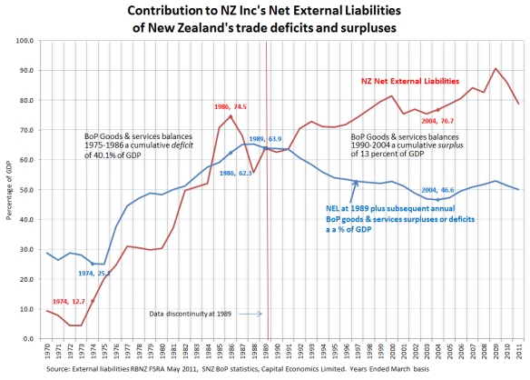
This week’s chart explores the contribution of the trade balance in the balance of payments to the evolution of New Zealand’s high external debt ratio.
The issue is significant because of the popular myth that the high net external debt ratio today results from a chronic inability of New Zealanders to save enough, for example, in the last two decades. This, it is thought, is the cause of the chronic balance of payments current account deficits since 1974. In reality, what was driving the deficits between around 1990 and 2004 was the cost of serving the net external debt built up by 1990.
This savings myth is bolstering the drive to force or subsidise today’s working age New Zealanders to save more.
The red line on the chart shows New Zealand’s net external liabilities as a percentage of GDP. It uses two time series published by the Reserve Bank of New Zealand in its May 2011 Financial Stability Report. The first series, from 1972 to 1989 is an unofficial series. The second series, from 1989 to 2011, is the official time series. (Statistics New Zealand has since published revised statistics, but the RBNZ’s second series suffices for the purposes of this analysis.)
The first point to observe about the red line is that its level today is largely a legacy of the events that caused the 1984 foreign exchange crisis. The ratio peaked at 74.5 percent in 1986 and is not vastly higher today.
The blue line in the chart plots how the net external debt to GDP ratio would have moved forward and backward through time from 1989 if the only factor operating had been the surplus or deficit in the trade balance of the balance of payments as a percentage of GDP in each successive year.
Focus first on the concurrent sharp rise in both the red and blue lines from the early 1970s to the late 1980s. The unofficial estimate of the net external debt rose from 12.7 percent of GDP in 1974 to 63.9 percent in 1989, a rise of 51.2 percentage points of GDP. That’s a massive contribution to today’s figure of around 80 percent.
The blue line shows the cumulative contribution to this rise of the large trade deficits (imports greater than exports) that occurred between 1975 and 1986. Summing the annual trade deficits as a percentage of GDP between 1975 and 1986 gives a cumulative deficit of 40.1 percent of GDP. That’s a big number too.
It follows that the large trade deficits that followed New Zealand’s failure to adjust rapidly and flexibly to the 1973-74 oil shock may explain roughly half of the net external debt of 80 percent of GDP that is causing such widespread angst today. This was not a savings deficiency story (see below). Instead the proximate reasons were the failure of the heavily controlled economy to respond adequately to the oil price shocks and the heavy overseas borrowing during this period to bolster the exchange rate and fund the large fiscal deficits.
Next, focus on the post-1989 period in the chart. The drop in the blue line occurs because, contrary to much popular belief, New Zealand ran surpluses overall in the balance of trade between 1990 and 2004.
It was only after 2004, when big government spending increases commenced, that the balance of trade returned to deficits, causing the blue line to lift slightly. The divergence between the blue and red lines after 1989 shows that the rise in net external liabilities from 63.9 percent of GDP in 1989 to 76.7 percent in 2004 was not a ‘spending beyond our means’ story. To the contrary, domestic (consumption and investment) spending was lower than domestic production/income on average during this period.
Another reason for not unduly focusing on the savings aspect is that it is perfectly sensible to borrow overseas to fund some portion of domestic investment as long as the returns from that investment adequately cover the cost of borrowing, taking risk into account.
Savings rates are one thing, competitiveness is another. New Zealand’s exposed industries can lose competitiveness at any given savings ratio simply because of adverse international or domestic events, such as the big rise in government spending that occurred after 2004.
The loss of competitiveness after 2004 is a real concern from an economic management perspective, given the historically favourable export prices relative to import prices during this period.
Those who insist on portraying today’s high net external debt ratio as a savings deficiency story should be aware that New Zealand’s average gross national savings ratio was actually higher, at 19.6 percent of GDP, between 1972 and 1987 than it was between 1988 and 2004 when it averaged 17.2 percent of GDP.
Not shown in the chart is the second major factor affecting the ratio of net external liabilities to GDP. This is the difference between the earnings rate payable on the net debt and the growth in GDP. The former increases the numerator, the latter the denominator. The rise in the red line in the chart after 1989, in conjunction with the fall in the blue line, suggests that the net earnings rate has exceeded the growth rate in GDP during this period.
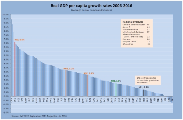
Since New Zealand is too small to affect investors’ required return on capital, those who are concerned to see the ratio fall should be focusing on raising the rate of growth in GDP. This needs to be done in conjunction with restoring competitiveness in the traded goods sector in order to stop the blue line from lifting unduly.
In summary, New Zealand’s high net external liabilities are largely a legacy of New Zealand’s pre-1984 ‘Polish shipyard’ economy (with apologies to post 1970s Poland). They reflect past economic mismanagement and adverse oil price shocks, rather than any sudden change in national savings rates. The reforms of the 1984-1991, including the move to a floating exchange rate, a disciplined monetary policy, and the progressive elimination of fiscal deficits, put an end to the chronic trade deficits of the earlier period. Unhappily, the 2004-2008 loss of competitiveness and government spending discipline does not even have an adverse terms of trade excuse.
It could be worse than futile to try to penalise the current generation of workers for pre-1984 poor economic management by interfering with their consumption/savings decisions. The focus instead should be on raising income growth, in part by raising external competitiveness. After all, given the income gap with Australia and the number of New Zealanders voting with their feet, many would argue that raising the growth rate should be the focus even if the net external debt ratio were half what it is today.
A related point for those preoccupied with savings, as distinct from a higher savings ratio, is that higher growth means higher incomes and likely higher savings and consumption.


