FRIDAY GRAPH: THE SPRAWLING BUREAUCRACY

A picture can tell as much as a thousand words. Here is a chart from a talk given by Andrew Kibblewhite, deputy chief executive of the Treasury, to the Institute of Policy Studies on 1 April this year.
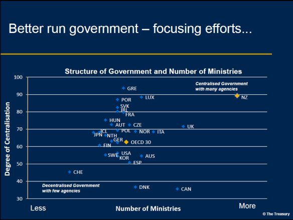
 In Mr Kibblewhite’s words, “This chart underscores just how comprehensively our small country has divvied up our state sector into a clutter of agencies.”

The government has embarked on some restructuring and mergers, but in my experience the gains from such efforts over the years have not been great. An article in today’s Business Herald suggests we may be seeing the same thing this time round. It reads:

The merger of the Department of Internal Affairs, National Library and Archives New Zealand; the coming-together of the Ministry of Agriculture and Forestry and the Food Safety Authority; and the merger of the Ministry of Research, Science and Technology  and the Foundation for Research, Science and Technology have gone relatively smoothly. The $24 million in savings over four years was originally going to be offset by some $11 million in transition costs. Now, though, the agencies have had to find another $8 million in capital expenditure from within their balance sheets to “provide the necessary infrastructure and capability” – much of which can be translated as “none of our computer systems will work with each other”.

Two things in my view are much more important than rearranging the bureaucratic furniture.

The first question that should be asked is whether we need parts of the furniture at all.
On coming to office John Key as minister of tourism abolished the Ministry of Tourism.  Has anybody noticed or cared?

Second, instead of focusing on restructuring the bureaucracy (often by establishing advisory groups of bureaucrats), the government would do better to focus on leadership by top quality CEOs. Numerous appointments in recent years have been unimpressive, and there has been little sign of the State Services Commission moving poor performers on. The government would find that top CEOs would solve many of the problems of bureaucratic sprawl and inflated headcounts by themselves.

FRIDAY GRAPH: PRIVATISATION

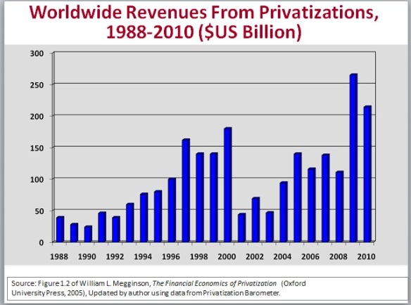
This chart comes from the presentations that Professor Bill Megginson of the University of Oklahoma gave in New Zealand this week. Megginson is arguably the leading academic expert in the field.

It shows that annual privatisation revenues have fluctuated but are currently at record levels.

The EU and US debt crises will no doubt give further impetus to privatisation.  SOEs have been effectively eliminated in the United Kingdom.

Megginson lists the lessons of privatisation research as follows.

  • Sales improve financial and operating performance

        – impact on employment less clear-cut

        – generally also yields fiscal bonus for government

  • But, privatisation does not always ‘work’

        – and governments often try to retain real control

  • Investors have benefited from privatisation

        – both short and long-term returns are positive

  • Governments should sell assets as quickly as possible, for cash, to highest bidder

        – favour SIPs (Share Issue Privatisations), allow foreign purchases when possible.

Visit www.nzbr.org.nz to view the presentation Professor Megginson gave at a New Zealand Business Roundtable CEO Forum.

FRIDAY GRAPH: FREE MARKET ATTITUDES

Here is an interesting chart based on a survey by GlobeScan, a polling firm, and published in The Economist (online) on 6 April 2011.

The survey tested attitudes on the question of whether the free market was the best system for the world’s future.

As one would expect, the United States ranked fairly high, with 59% agreeing ‘strongly’ or ‘somewhat’ with the proposition.  But this was down from 80% when the question was first asked in 2002, perhaps influenced by the interventionist Bush and Obama administrations and the GFC (global financial crisis).

More interestingly, there was more support for the free market in China than in the United States.  Both China and Brazil have seen strong growth in their rankings in recent years.

A German economist suggested to me that Germany’s top ranking may have reflected a different ‘social market’ interpretation of the question.

Australia has a relatively low ranking and New Zealand was not covered.

FRIDAY GRAPH: LOCAL GOVERNMENT RATES

The chart below shows what has been happening to local government rates in New Zealand in recent years.


Two points are worth noting. 

The first is the steep rise in the ratio of rates to GDP following the introduction of the Local Government Act 2002.  This is a departure from the trend in the last century when council spending and rates stayed a fairly constant proportion of GDP (while central government spending and taxes rose).

The Clark-Cullen government maintained that the wider purposes and power of general competence bestowed on councils in that Act would not lead them to spend and rate more.  This claim was naïve, as the chart confirms. The forecast implies local government revenue increases of 6.3% per annum to 2019.

Second, the projections suggest that rates will double from around 2% of GDP a decade ago to 4% by 2019. Councils as well as central government are crowding out the private sector.

FRIDAY GRAPH: THE YOUTH UNEMPLOYMENT SCANDAL

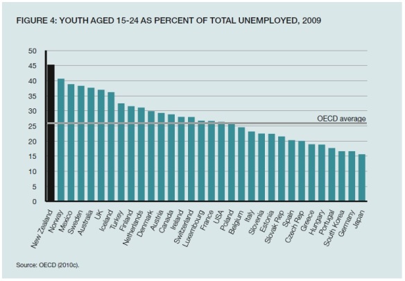
This chart from a recent New Zealand Institute publication tells a familiar story.

We think of countries like France and the United States as having shocking rates of youth unemployment (see my Friday Graph of 15 July for the United States).  And indeed they do.  In those countries youth unemployed as a percent of total unemployed is around 25%.  This is a far higher rate than in earlier decades when labour markets were less regulated.

But the chart shows that it is New Zealand that stands out with youth unemployment being 45% of total unemployment, the worst outcome in the OECD.

Why are our political parties not talking about this appalling state of affairs?  One reason is that many of them are complicit in bringing it about.  The abolition of the youth minimum wage, sponsored by the Greens and Labour, is clearly a major contributing factor to the surge in youth unemployment.  National in office has declined to reintroduce youth wages.  The New Zealand Institute in its report also ducked the issue.

This conspiracy of silence on the subject is an indictment of New Zealand’s seeming inability to face up to grim social realities.

FRIDAY GRAPH: THE IMPACT OF MINIMUM WAGES ON YOUTH

This graph from a 1 July 2011 Wall Street Journal article tells a familiar story.

The article explains that:

This is a rotten summer for young Americans to find a job. The Department of Labor reported last week that a smaller share of 16-19 year-olds are working than at anytime since records began to be kept in 1948.

Only 24% of teens, one in four, have jobs, compared to 42% as recently as the summer of 2001. The nearby chart chronicles the teen employment percentage over time, including the notable plunge in the last decade. So instead of learning valuable job skills – getting out of bed before noon, showing up on time, being courteous to customers, operating a cash register or fork lift – millions of kids will spend the summer playing computer games or hanging out.

The lousy economic recovery explains much of this decline in teens working, and some is due to increases in teen summer school enrollment. Some is also cultural: Many parents don’t put the same demands on teens as they once did to get out and work.

However, there is more to the story:

But Congress has also contributed by passing one of the most ill-timed minimum wage increases in history. One of the first acts of the gone-but-not-forgotten Nancy Pelosi ascendancy was to raise the minimum wage in stages to $7.25 an hour in 2009 from $5.15 in 2007. Even liberals ought to understand that raising the cost of hiring the young and unskilled while employers are slashing payrolls is loopy economics.

As always, such minimum wage increases hit disadvantaged groups hardest:

Black teens have had the worst of it, with their unemployment rate rising to 41.6% in April from 29% in 2007, faster than almost any other group. A 2010 study by economists William Even of Miami University of Ohio and David Macpherson of Trinity University found that as a result of the $2.10 increase in minimum wage, “teen employment dropped by 6.9 percent… For the teen population with less than 12 years of education completed, teen employment dropped by 12.4 percent.” For teens priced out of the labor market, their wage fell to zero.

All this mirrors New Zealand’s experience in first increasing youth minimum wages and then abolishing them altogether.  It has been estimated that these moves have cost around 10,000 jobs for young people.

Note too that the current US minimum wage is US$7.25 an hour or under NZ$9.00.  Our current minimum wage is $13.00 an hour, a ludicrous level for a country that is far less wealthy than the United States.

Why former Green MP Sue Bradford has not been pilloried for her ignorance or wilful blindness about the impact of abolishing youth rates, and why the government has not moved to reinstate them, is impossible to fathom.

FRIDAY GRAPH: PRIVATISATION HITS NEW RECORDS

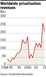
According to FT.com, privatisation is again sweeping the world:

…with governments hauling in a record $213bn in revenues last year in a massive sale of everything from ports to phones and gambling companies to gas groups.

The trend looks set to continue globally this year with another $150bn on the block so far, suggesting that revenues from privatisation will near the 2010 figure, the highest achieved since governments began offloading assets three decades ago.

Large deals on the table include the $6.3bn auction of Polkomtel, the Polish mobile phone operator, and Mongolia’s 30 per cent IPO of a stake in the mining company Erdenes Tavan Tolgoi, expected to raise as much as $2bn.

The figures have been bolstered by the offloading of stakes acquired in government rescues throughout the financial crisis.

The biggest privatisation this year is expected to be the US Treasury’s estimated $15bn sale of shares in Ally Financial, General Motors’ financial arm, bought when the car manufacturer was bailed out in 2009.

Although revenues from asset sales were technically higher in 2009 than in 2010, almost two-thirds of those sales involved bank repurchases of mostly preferred stock that were acquired through government bail-outs during the financial crisis, according to William Megginson, professor at the University of Oklahoma.

Last year, governments sought to devolve responsibility for infrastructure and assets in almost every political system and country.

Significant deals included Agricultural Bank of China’s $22.1bn IPO, the largest stock offering in history.

The 27 EU nations have traditionally been slow to privatise but with sell-offs a condition of bail-outs, Spain, Poland, Portugal and Greece are set to unleash a wave of asset sales.

There were several big infrastructure sales last year but many of the deals involved the sale of long-term contracts rather than entire assets. For example, the Queensland state government auctioned the right to operate the Port of Brisbane for 99 years.

The Chinese, Indian and Polish governments were involved in a number of sell-offs, partly aimed at promoting their capital markets. But the government retains a controlling stake in deals such as AgBank’s.

New Zealand governments have stood out from these worldwide trends for over a decade.  In this they were joined only by a handful of countries like North Korea and Myanmar.  I know of no other centre-left party that has adopted the anti-privatisation polices of New Zealand Labour.  It is pleasing that the government is seeking a mandate to resume a privatisation programme at the forthcoming election.

Professor William Megginson, a leading authority on privatisation, will be presenting on the subject at a CEO Forum to be held at the Business Roundtable’s offices at 5.30 pm on 8 August.  Expressions of interest are welcome.

FRIDAY GRAPH: US vs EU (and NZ)

Today’s Friday Graph is courtesy of prolific chart-maker Mark Perry:

In a New York Times editorial last year titled ‘Learning from Europe’ Paul Krugman wrote:

The story you hear all the time about Europe– of a stagnant economy in which high taxes and generous social benefits have undermined incentives, stalling growth and innovation – bears little resemblance to the surprisingly positive facts. The real lesson from Europe is actually the opposite of what conservatives claim: Europe is an economic success, and that success shows that social democracy works. The European economy works; it grows; it’s as dynamic, all in all, as our own.

The BEA recently released data for the amount of GDP produced by US states in 2010, which allows for an updated comparison with European countries (and Japan and Canada).  See the table below (international countries are adjusted for PPP).  Key findings:

1. The European Union as a group ($32,700 GDP per capita in 2010) ranks below America’s poorest state, Mississippi ($32,764).

2. Even relatively wealthy (by European standards) Switzerland would rank #32 as a US state, behind Georgia.  The countries of Belgium and Germany would rank even lower at #46 and #47, and the United Kingdom, Finland, and France would be close to the bottom of American states, below #48 South Carolina.

3.Spain, Italy, Greece and Portugal all rank below America’s poorest state (Mississippi) for GDP per capita.

On a similar PPP basis, New Zealand comes in at US$27,700, between Greece and Portugal.

FRIDAY GRAPH: NEW ZEALAND’S SPEND-UP

Here is a graph from the latest OECD Economic Outlook.  It’s an illustration of how much more OECD governments are projected to be spending in the year ahead compared with average levels of spending in the period 1993-2012.  The government spending data are on the OECD basis which is standardised across OECD countries, and includes for New Zealand central and local government.

The chart shows that for the current year, government spending in New Zealand is at an all-time high.  It currently stands at 46.2% of GDP, over 2 percentage points of GDP higher than the 1993-2012 average.  Spending has gone up by more than the OECD average, and only by slightly less than Greeceand Portugal, which is food for thought. Sweden has done best to rein in government spending, albeit from a high long-term average.

No OECD country has achieved sustained rapid GDP growth (4% per capita or more) with government spending at New Zealand’s current level of over 40% of GDP.

FRIDAY GRAPH: A CLIMATE-CHANGE DOOMSAYER BET

 Don Boudreaux masterfully continues the Julian Simon tradition in his WSJ article “More Weather Deaths? Wanna Bet?”, according to Mark Perry in his blog Carpe Diem:

Writing recently in the Washington Post, environmental guru Bill McKibben asserted that the number and severity of recent weather events, such as the tornado in Joplin,Mo., are too great not to be the result of fossil-fuel induced climate change. He suggested that governments’ failure to reduce emissions of greenhouse gases will result in more violent weather and weather-related deaths in the future. And pointing to the tragedy in Joplin, Mr McKibben summarily dismissed the idea that, if climate change really is occurring, human beings can successfully adapt to it.

“There’s one problem with this global-warming chicken little-ism”, Perry writes.  “It has little to do with reality. National Weather Service data on weather-related fatalities since 1940 show that the risks of Americans being killed by violent weather have fallen significantly over the past 70 years.”

Perry notes that:

The annual number of deaths caused by tornadoes, floods and hurricanes, naturally, varies. For example, the number of persons killed by these weather events in 1972 was 703 while the number killed in 1988 was 72. But amid this variance is a clear trend: the number of weather-related fatalities, especially since 1980, has dropped dramatically.

For the 30-year span of 1980-2009, the average annual number of Americans killed by tornadoes, floods and hurricanes was 194 – fully one-third fewer deaths each year than during the 1940-1979 period. The average annual number of deaths for the years 1980-2009 falls even further, to 160 from 194, if we exclude the deaths attributed to Hurricane Katrina, most of which were caused by a levee that breached on the day after the storm struck land

This decline in the absolute number of deaths caused by tornadoes, floods and hurricanes is even more impressive considering that the population of the United States more than doubled over these years – to 308 million in 2010 from 132 million in 1940.


 This is Don Boudreaux’s bet:

“So confident am I that the number of deaths from violent storms will continue to decline that I challenge Mr. McKibben – or Al Gore, Paul Krugman, or any other climate-change doomsayer – to put his wealth where his words are. I’ll bet $10,000 that the average annual number of Americans killed by tornadoes, floods and hurricanes will fall over the next 20 years. Specifically, I’ll bet that the average annual number of Americans killed by these violent weather events from 2011 through 2030 will be lower than it was from 1991 through 2010.

“If environmentalists really are convinced that climate change inevitably makes life on Earth more lethal, this bet for them is a no-brainer. They can position themselves to earn a cool 10 grand while demonstrating to a still-skeptical American public the seriousness of their convictions. But if no one accepts my bet, what would that fact say about how seriously Americans should treat climate-change doomsaying? Do I have any takers?”